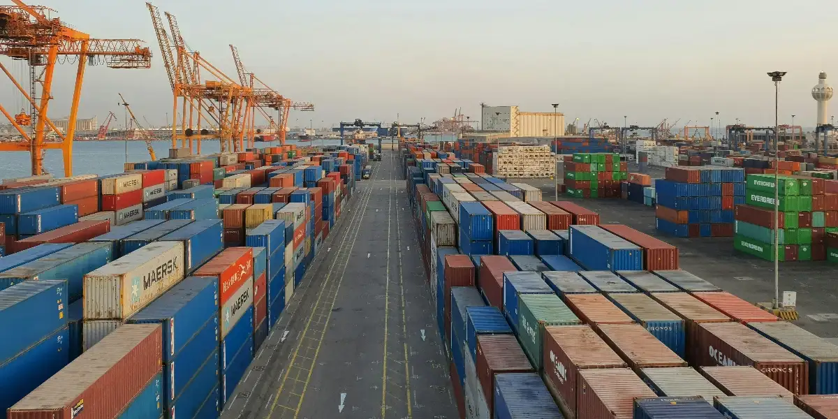
Port congestion is no longer a question of whether ships are waiting outside a port. In most major ports today, vessels may continue moving, berthing, or adjusting speeds while congestion quietly builds in the background. This is why many logistics teams struggle with a familiar problem: the port congestion data is available, the charts look detailed, yet it is still unclear what the numbers really mean for shipment delay, freight risk management, and customer commitments.
Modern port congestion is designed to show not just delay, but uncertainty. To use it effectively, understanding how different congestion metrics work together is critical. This helps identify vessel delay risk and prevent shipment delays due to port congestion.
This guide explains the port congestion meaning behind commonly used metrics, why no single number tells the full story, and how to interpret global port congestion data in a way that actually supports decision-making. This explainer complements our individual port-congestion pages, which track live congestion status and trends across major global ports.
Why port congestion is often misunderstood in freight risk management
Port congestion is frequently reduced to a single headline metric. How long are vessels waiting, or how many ships are at anchorage? While these numbers are useful, they rarely provide the full picture of vessel delays caused by port congestion.
Congestion is not evenly distributed. Some vessels may berth quickly, while others face extended vessel delay due to berth availability, yard congestion, labor constraints, or carrier scheduling strategies. When teams rely only on averages or vessel counts, they miss the variability that drives shipment delay risk.
This is why modern freight risk management relies on percentiles and distribution-based congestion metrics. These metrics help answer a more important question. How predictable is the port congestion status right now?
How port congestion is measured using port congestion data
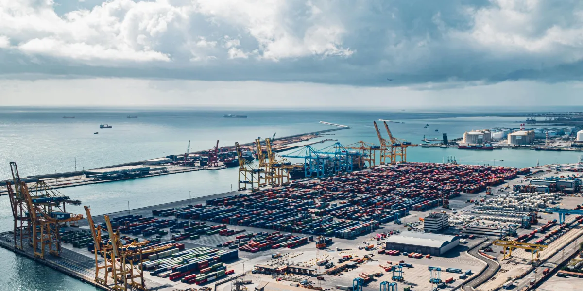
Traditional congestion monitoring focused on visible queues. If ships were anchored outside the port, congestion was assumed to be high. That approach no longer reflects how global port congestion operates today.
Ports now use dynamic scheduling, pre-berth holding areas, and slow-steaming strategies that spread vessel delays over time. Ships may appear to move continuously even when operational pressure is high, and the risk of shipment delay is increasing.
To reflect this reality, modern port congestion data is measured using:
- Percentile-based vessel wait times
- Long tail congestion indicators
- Real-time vessel backlog signals
- Congestion categories for easier benchmarking
Each metric captures a different dimension of port congestion. The real value comes from understanding how they interact to support ocean freight visibility and exception management in logistics.
Median Wait Time (P50): Typical shipment delay exposure
What it shows
The median wait time, also known as P50, represents the midpoint of all vessel wait times at a port. Half of the vessels wait less than this time, and half wait longer.
This metric answers a basic question. What does a typical vessel experience at this port today?
What it does not show
The median hides extremes. A stable P50 does not mean the risk of shipment delay due to port congestion is low. It only means most vessels are not facing excessive delays.
When it matters most
P50 is useful for understanding baseline congestion status and comparing global ports at a high level. It is less effective for freight exception management during volatile periods.
Example
A port may show a P50 wait time of around 1 day, suggesting relatively normal conditions for most vessels. At the same time, a subset of vessels could be waiting 5 to 6 days due to berth constraints or scheduling spillovers. These longer vessel delays do not affect the median but still create shipment delay risk for specific cargo and trade lanes.
75th Percentile (P75): Early signals of vessel delay risk
What it shows
P75 indicates how long 75 percent of vessels wait or less. It highlights the vessel delay that affects more than just a small minority.
This metric often rises before the median does, making it an early indicator of growing port congestion.
What it does not show
P75 does not capture the most extreme delays. It sits between typical operations and worst-case congestion scenarios.
When it matters most
P75 is valuable during seasonal peaks, weather disruptions, or demand surges where shipment delay risk begins to spread.
Example
If the median wait time remains steady at about 1 day, but the 75th percentile increases from 2 days to 3.5 days, it signals that congestion is spreading beyond isolated cases. More vessels are now experiencing delays that could start to affect cut-off planning and downstream schedules.
90th Percentile (P90): Managing extreme shipment delay scenarios
What it shows
P90 captures long tail events. Ninety percent of vessels wait this long or less, meaning the remaining ten percent face significantly longer vessel delay due to port congestion.
This metric reveals the severity of shipment delay when congestion spikes.
What it does not show
P90 does not describe the typical experience. It measures exposure to extreme delays rather than averages.
When it matters most
P90 is critical for buffer planning, high-value cargo, and proactive freight risk management.
Example
Two ports may both show a median wait time close to 1 day, but one port has a P90 of 6 days while the other peaks at 3 days. The first port carries a much higher risk of extreme shipment delays, even though most vessels move through both ports at a similar pace.
Vessels Waiting: Real-time port congestion status
What it shows
This metric counts the number of vessels currently waiting at anchorage or in pre-berth areas.
It reflects the immediate backlog and visible port congestion status.
What it does not show
Vessels waiting do not indicate how long those vessels will wait. A small queue can still result in extended vessel delay if berth productivity is constrained.
When it matters most
This metric supports short-term monitoring and day-to-day exception management in logistics.
Example
A port may have 6 to 8 vessels waiting at anchorage, which appears manageable on the surface. However, if berth productivity is constrained, those vessels could still face waits of 4 days or more. Conversely, another port might show 15 vessels waiting, but with fast berth turnover, average delays may remain under 2 days.
Long Tail Congestion: Unpredictability in global port congestion
What it shows
Long tail congestion is an index that flags outlier delays beyond normal operating patterns.
It highlights unpredictability rather than average vessel delay.
What it does not show
It does not quantify the delay in days. Instead, it signals dispersion in vessel experiences, which increases the risk of shipment delays.
When it matters most
This metric is especially useful during labor disruptions, weather events, or infrastructure issues that affect only certain vessels.
Example
A port may report a median wait time of less than 1 day, yet still show elevated long-tail congestion because a small group of vessels is experiencing delays of 7 to 10 days. This pattern indicates uneven outcomes and higher unpredictability, even if average congestion appears low.
Congestion Category: Simplifying the port congestion meaning
Congestion categories such as Low, Medium, or High are derived from percentile thresholds. They simplify port congestion meaning for benchmarking and high-level communication, while detailed metrics support deeper freight risk analysis.
How to read port congestion metrics together for ocean freight visibility: An example
The most actionable insights emerge when metrics are analyzed together. Let's see how to interpret the congestion status from this table.

The congestion category reflects the overall operating condition of the port, based on how most vessels are affected. It does not mean every vessel has the same experience.
Here is how the data in the table explains each outcome:
- Ports A and E are classified as Low congestion because the median wait time is very low at 0.3 days. This means most vessels move through the port with minimal delay. However, Port E shows long-tail congestion, indicating that while most vessels experience smooth operations, a small numberface significantly longer delays. These outlier delays do not impact the overall congestion category but signal unpredictability for specific shipments.
- Port B falls into Medium congestion because wait times increase steadily across percentiles. A median of 2 days and a P90 of 4.1 days show that delays are no longer isolated and begin affecting a wider share of vessels, even though the number of vessels waiting remains low.
- Ports C and D are categorized as High congestion, but for different reasons.
Port C shows consistently high wait times across P50, P75, and P90, which means most vessels are delayed, not just a few. Port D shows extreme separation between percentiles, with a P90 of 25 days, indicating severe long-duration delays for some vessels.
This table highlights an important point.
The congestion category reflects how the majority of vessels are affected, while long-tail congestion highlights risk and variability. A port can appear operationally smooth for most shipments and still carry a delay risk for a smaller subset of cargo, as seen with Port E.
These patterns are far more useful than tracking a single congestion metric.
Why port congestion can look high even when vessels are moving
Ports manage congestion through speed adjustments, berth sequencing, and schedule recovery tactics. Vessels may slow steam, arrive just in time, or wait offshore in controlled patterns.
As a result, global port congestion does not always appear as a static queue. Percentile-based port congestion data captures hidden vessel delay more effectively than visual counts alone.
Using port congestion data for freight exception management
When interpreted correctly, port congestion data enables:
- More realistic ETA buffers
- Better customer communication around shipment delay
- Smarter routing and cut-off decisions
- Early identification of freight exceptions before delays escalate
Port congestion is not just about how long vessels wait. It is about predictability and risk. Percentiles, long-tail indicators, and backlog metrics are used to improve ocean freight visibility and proactive exception management in logistics.
By understanding how these metrics work together, logistics teams can move from reacting to shipment delays to managing freight risk with confidence.
If you are looking to access reliable port congestion insights for the ports you monitor or the trade routes you operate on, this data can be exported directly from the Port Congestion Tracker or accessed via the API for TMS integration and automated planning workflows.
You can also request a demo to explore how port congestion insights can be applied across your operations.